

Casino Landing Pages.
We design fast, focused casino landing pages that align campaign intent, localized trust signals, offer clarity, and a low-friction registration path.
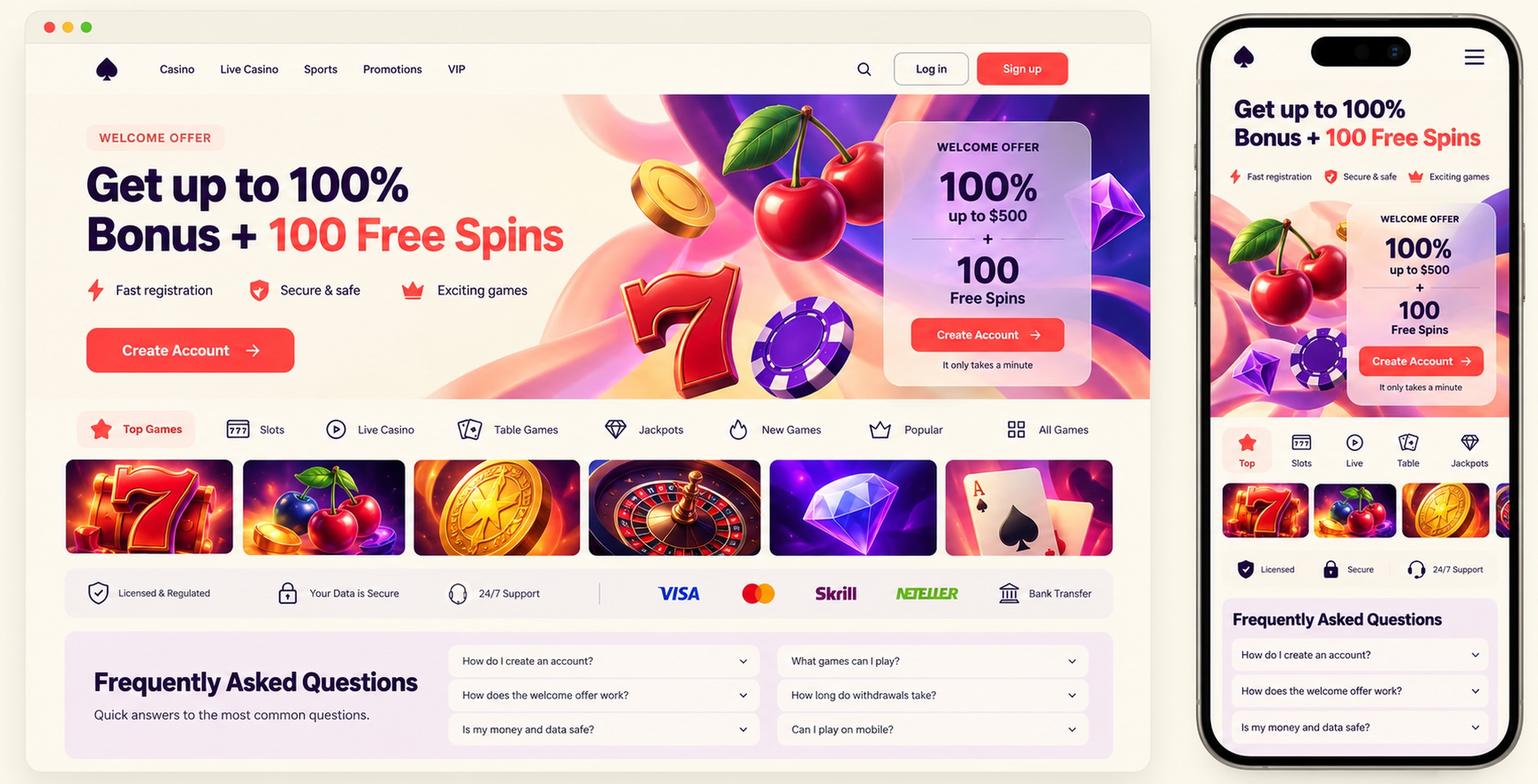
The page should continue the promise made by the ad
A useful landing page connects the traffic source, offer conditions, payment confidence, relevant game content, responsible-play information, and the next action. Visitors should not have to reinterpret the campaign after they click.
A clear conversion story
The opening should immediately feel related to the campaign that earned the click. From there, message hierarchy explains the offer and its conditions without forcing visitors to resolve competing claims.
Proof, payment cues, licensing context, and relevant content answer the trust questions that appear before registration. The call to action then leads into a responsive entry point with as little friction as the product allows. If important terms materially change the offer, they need to be readable near the claim rather than buried at the end of the page.
Different traffic arrives with different questions
A paid-social visitor may know the promotion but not the brand. Affiliate traffic can arrive with stronger intent and a comparison already in mind. Search traffic often needs a clearer explanation of the product itself. The page structure should reflect that starting point instead of serving every campaign with the same hero, game grid, and bonus strip.
Localization goes beyond translated copy. Currency, payment methods, game availability, licensing language, age restrictions, offer eligibility, and support details may change by market. Planning those variants early prevents layouts from breaking when labels grow or required notices move closer to the main claim.
Mobile constraints shape the page
On a small screen, the first view has limited room for a headline, offer, qualifier, visual, and action. We set a clear order and remove anything that delays the next useful step. Registration fields, keyboards, cookie controls, and sticky elements are considered as part of the layout, not added after approval.
Asset weight matters as much as visual polish. Responsive images, restrained animation, stable content areas, and sensible font loading help the page remain usable on slower mobile connections. A dramatic entrance is not useful if it hides the offer while the visitor waits.
Designed for campaigns and testing
Delivery includes the responsive experience, reusable content sections, localization behavior, optimized assets, and implementation guidance. The handoff should also define component states, CTA behavior, tracking points, and the intended path into registration so design decisions survive implementation.
When testing is part of the plan, each variant needs a clear hypothesis: for example, whether earlier payment reassurance helps a specific traffic source, or whether a shorter explanation suits returning visitors. Changing several unrelated elements at once may produce a winner, but it will not explain why the page performed differently.